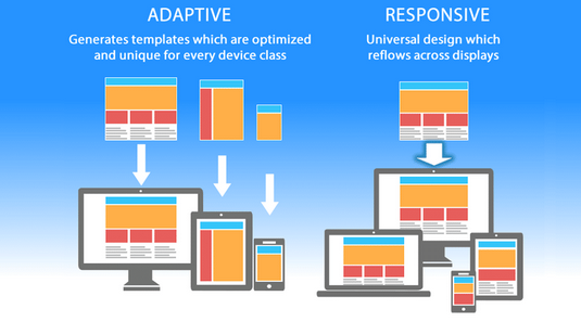
In today’s digital world, users browse the internet through a wide range of devices—smartphones, tablets, laptops, desktops, and even smart TVs. A website that looks good and works smoothly across all these devices is no longer optional; it is a necessity. This is where responsive web design comes in. A responsive website automatically adapts its layout, images, and functionality depending on the device’s screen size, ensuring a consistent and user-friendly experience.
Whether you are a beginner or an intermediate web developer, understanding how to build a responsive website is essential. This comprehensive guide walks you through the step-by-step process of designing, developing, and testing a fully responsive website.
1. What Is a Responsive Website?
A responsive website adjusts its layout and elements automatically based on the viewer’s screen size. Instead of creating separate websites for mobile and desktop, responsive design uses:
-
Flexible grids and layouts
-
Scalable images
-
CSS media queries
-
Fluid typography
These techniques ensure that users enjoy optimal readability, navigation, and usability no matter what device they use.
Why Responsive Design Matters
-
Improves user experience by preventing zooming and horizontal scrolling.
-
Boosts SEO, as search engines prefer mobile-friendly websites.
-
Reduces development cost, since you maintain one website instead of multiple versions.
-
Increases conversions, because users can easily navigate and take action.
-
Keeps your website future-proof for new devices and screen sizes.
2. Planning Your Responsive Website
Before writing a single line of code, proper planning is crucial. A well-organized plan saves time and ensures a smooth development process.
Define the Purpose of Your Website
Ask yourself:
-
What is the primary goal?
-
Who is the target audience?
-
What functionalities are essential?
Understanding the goals helps you identify the right layout and structure.
Create a Sitemap
A sitemap outlines the structure of your website. It helps you plan:
-
Main pages
-
Subpages
-
Navigation flow
This ensures a logical and user-friendly website structure.
Sketch Wireframes for Different Screens
Wireframes are rough layouts of your pages. Create versions for:
-
Mobile (small screens)
-
Tablet (medium screens)
-
Desktop (large screens)
This helps visualize how elements will rearrange across devices.
3. Understanding the Core Tools and Technologies
To build a responsive website, you must be familiar with three core technologies:
HTML (HyperText Markup Language)
This defines the structure of your webpage—headings, paragraphs, images, buttons, and more.
CSS (Cascading Style Sheets)
This controls your website’s visual appearance—colors, spacing, fonts, layout, and responsiveness.
JavaScript
This adds interactivity—menus, animations, sliders, pop-ups, etc.
CSS Frameworks (Optional but Helpful)
-
Bootstrap
-
Tailwind CSS
-
Foundation
These frameworks include pre-built responsive classes that speed up development.
4. Setting Up Your Development Environment
Before coding, set up the tools you’ll use.
Text Editor or IDE
Choose from:
-
Visual Studio Code
-
Sublime Text
-
Atom
-
WebStorm
These editors make writing and organizing code easier.
Local Server (Optional)
Useful for advanced projects:
-
XAMPP
-
WAMP
-
Node.js Live Server
Folder Structure
Create a clean folder structure:
This helps keep your files organized.
5. Start Coding the Structure with HTML
Begin by creating the basic HTML structure.
Use Semantic HTML Tags
Semantic tags make your website more accessible and SEO-friendly:
-
<header> -
<nav> -
<section> -
<article> -
<footer>
Mobile First Approach
Start designing the website for small screens first, then scale up.
This approach ensures your website is optimized for smartphones and prevents layout issues.
Example of Mobile-First HTML Structure
6. Applying Responsive Layouts Using CSS
Once your structure is ready, start adding responsive styling.
Use the Viewport Meta Tag
This line ensures proper scaling on mobile devices:
Use a Fluid Grid Layout
Instead of fixed widths like px, use flexible units like:
-
%(percentages) -
vwandvh(viewport width and height) -
remandem(scalable font sizes)
Responsive CSS Example
Use Media Queries
Media queries change styles depending on screen size.
Basic Media Query Example
This makes the layout adapt for larger screens.
7. Adding Flexible Images and Media
Images must scale smoothly across screen sizes.
Use max-width: 100%;
This ensures images never overflow their containers.
Use Picture Element for Different Images
For advanced responsiveness:
8. Responsive Typography
Text size should adapt smoothly.
Use Scalable Units
Use:
-
em -
rem -
vwfor fluid text
Example
This scales automatically based on screen width.
9. Creating a Responsive Navigation Menu
Navigation is one of the most important parts of responsive design.
Mobile Navigation (Hamburger Menu)
For small screens:
-
Collapse menu links
-
Use a hamburger icon
-
Toggle menu visibility with JavaScript
Desktop Navigation
For larger screens:
-
Display full horizontal menu
Basic JavaScript for Toggle Menu
10. Using CSS Flexbox and Grid for Layout
Modern responsive websites rely heavily on:
-
Flexbox
-
CSS Grid
Flexbox
Perfect for:
-
Navigation bars
-
Boxes
-
Simple layouts
Grid
Ideal for:
-
Complex multi-column layouts
-
Responsive sections
Grid Example
11. Testing Your Responsive Website
Testing is a crucial step.
Test on Different Screen Sizes
Use browser tools:
-
Chrome DevTools
-
Firefox Responsive Mode
-
Edge Developer Tools
Test widths:
-
360px (small phones)
-
768px (tablets)
-
1024px (laptops)
-
1440px+ (desktops)
Test Across Browsers
Ensure compatibility on:
-
Chrome
-
Firefox
-
Safari
-
Edge
Test on Real Devices
If possible, test on:
-
Android phones
-
iPhones
-
Tablets
-
Laptops
12. Optimizing for Performance
Responsive design should also be fast.
Compress Images
Use optimized images like:
-
WebP
-
AVIF
-
Compressed JPEGs
Minify CSS and JavaScript
Minifying reduces file sizes and speeds up loading.
Use Caching
Cache static files for faster repeat visits.
Lazy Load Images
Load images only when they enter the viewport.
13. Using a Responsive Framework (Optional)
If coding from scratch is time-consuming, use a responsive CSS framework.
Bootstrap
Advantages:
-
Pre-built responsive grid
-
Ready-made components
-
Faster development
Tailwind CSS
Advantages:
-
Highly customizable
-
Utility-first approach
-
Lightweight and flexible
These frameworks simplify responsive design significantly.
14. Common Responsive Design Mistakes to Avoid
Avoid these pitfalls:
1. Fixed Width Containers
Avoid using:
Use flexible units instead.
2. Not Testing on Real Devices
Emulators are helpful but not perfect.
3. Overusing Media Queries
Use only when necessary; let Flexbox and Grid handle most responsiveness.
4. Ignoring Slow Connections
Optimize assets for users with low internet speeds.
5. Large Navigation Menus
Make sure they are collapsible and mobile-friendly.
15. Final Checklist for a Responsive Website
Before launching your site, ask:
-
Does the website display properly on all screen sizes?
-
Is the navigation easy to use on mobile?
-
Are images optimized and responsive?
-
Does the text scale smoothly?
-
Is the layout fluid and visually appealing?
-
Is loading speed fast across devices?
-
Does it look good in all major browsers?
Conclusion
Building a responsive website is essential in today’s multi-device world. By following a mobile-first approach, using flexible layouts, applying media queries, and testing across different devices, you can create a website that looks great and performs well everywhere.
With this step-by-step guide, you now have a complete roadmap—planning, designing, coding, optimizing, and testing your responsive website. Whether you’re creating a personal blog, business site, or professional portfolio, responsive design ensures your website delivers the best possible experience to your visitors.